GOAL: AG Architecture is a firm that has developed a focus on architecture in world of retirement communities and apartment communities. Not only was community a large part of the work they did but also showed in their personalties and and in their office culture. Their previous identity had become dated and did not encompass the friendly and sophisticated feeling that the film had developed.
RESULTS: The phrase A Sense of Community was first developed uniting the brand as it relates to both what the firm does and how they do it. The updated identity symbolizes the concept of community with the uniting of the "a" and the "g", initials of the founders and current principles with the arc reflection the style of architecture as well as the over-arching feeling of community. The updated brand with t's strong, orange, blacks and silvers gives the firm a unique verbal and visual focus which resonates locally, regionally and nationally.

Brand Identity
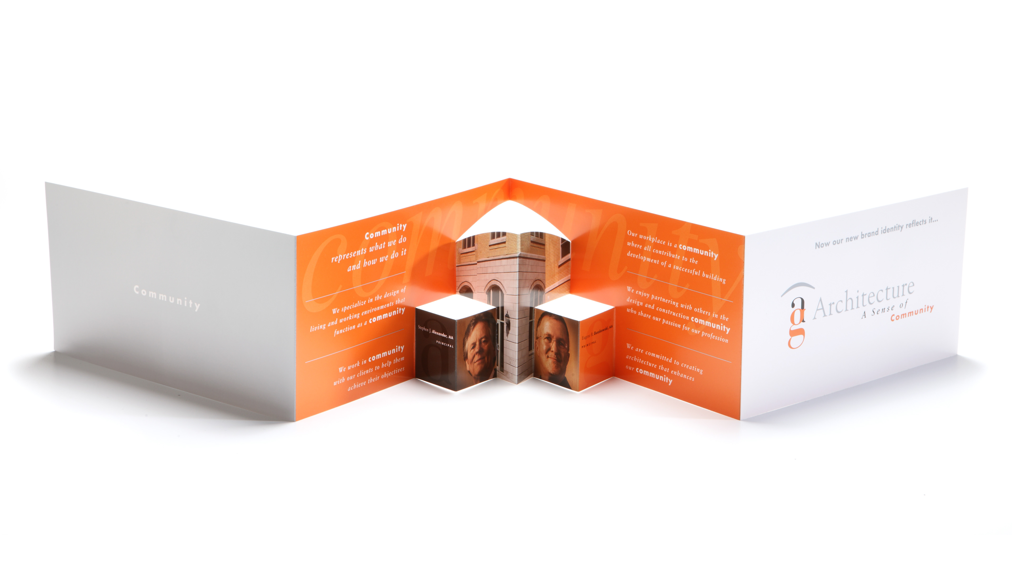
Brand Launch Piece

Business System
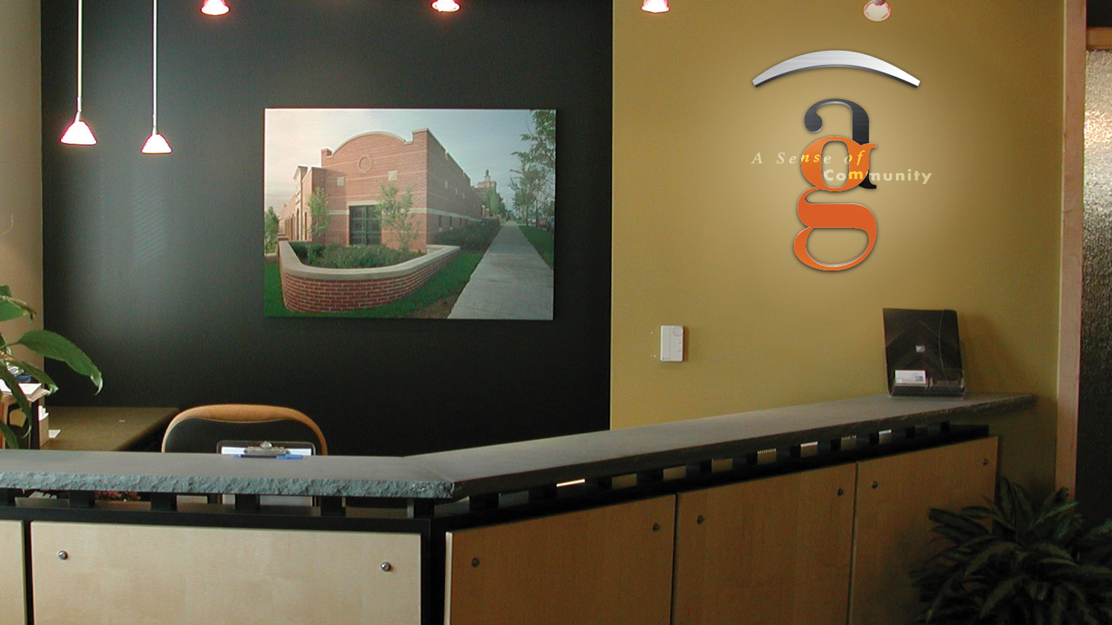
Lobby Signage
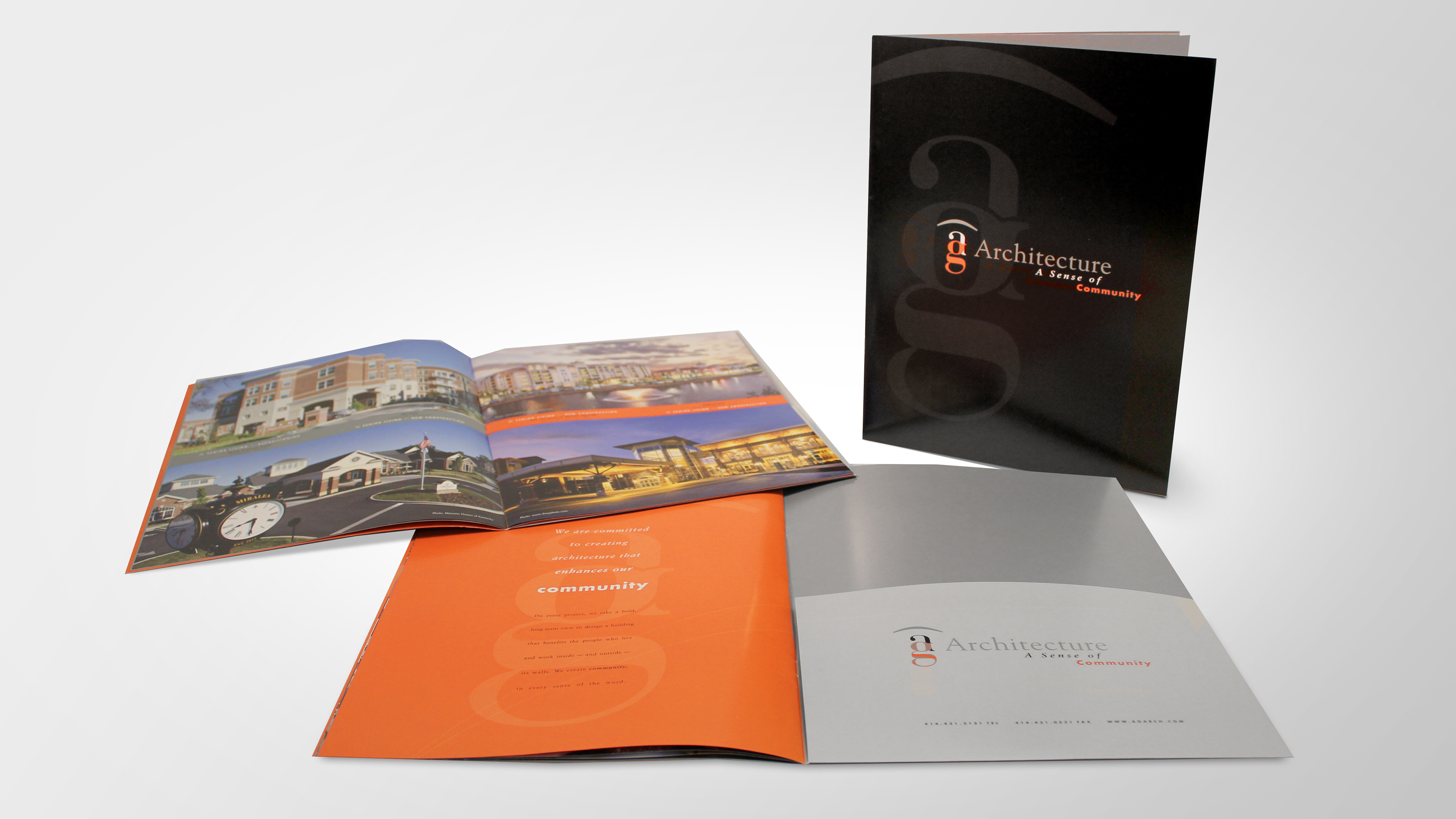
Capabilities Brochure

Project Update Brochure

Newsletter