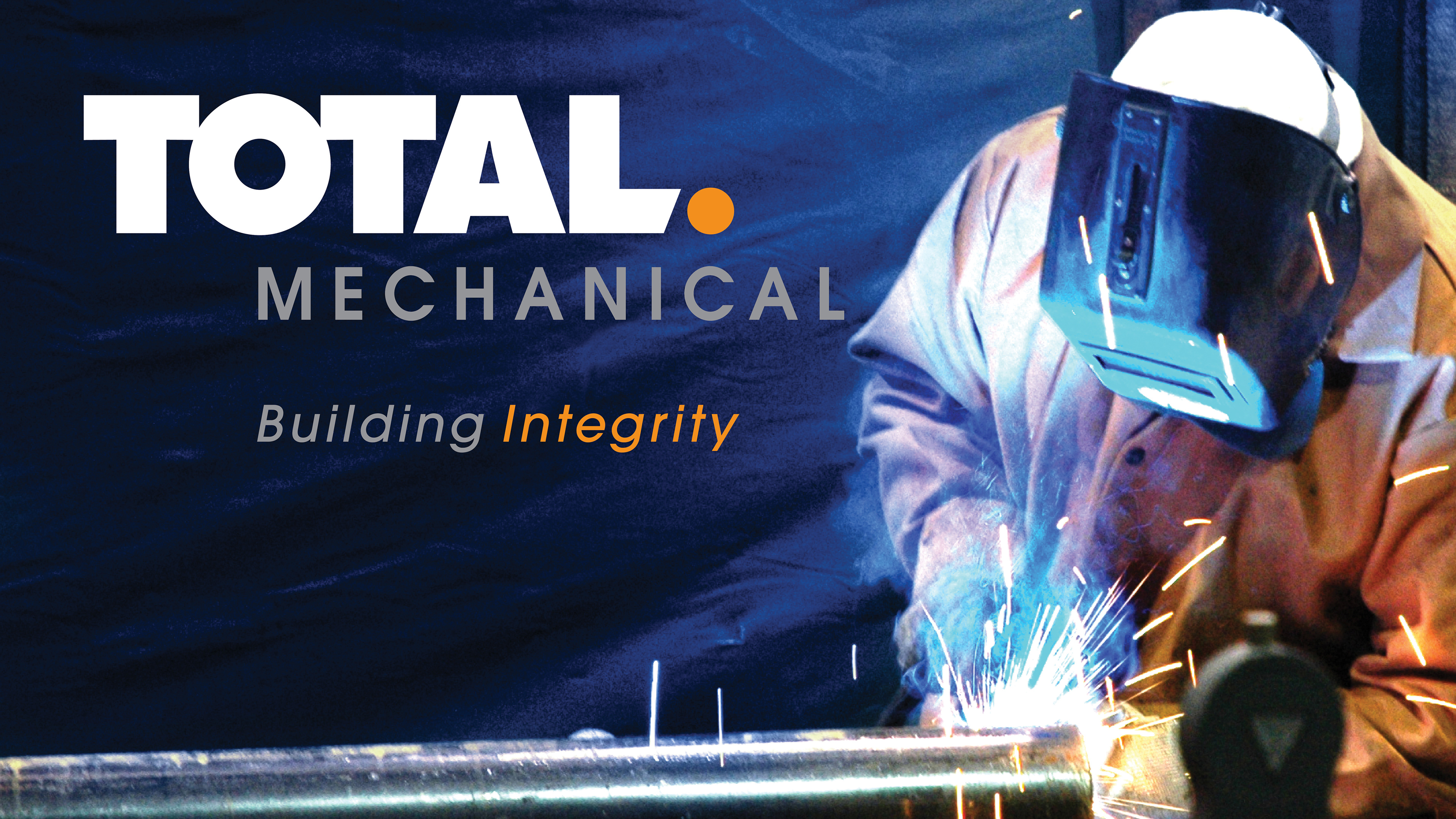
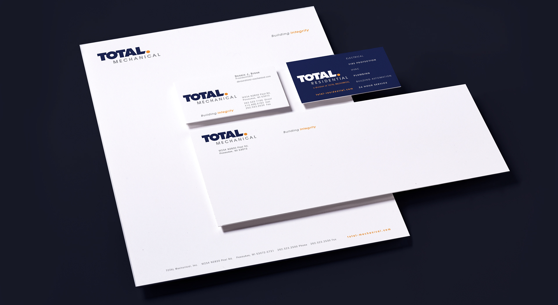
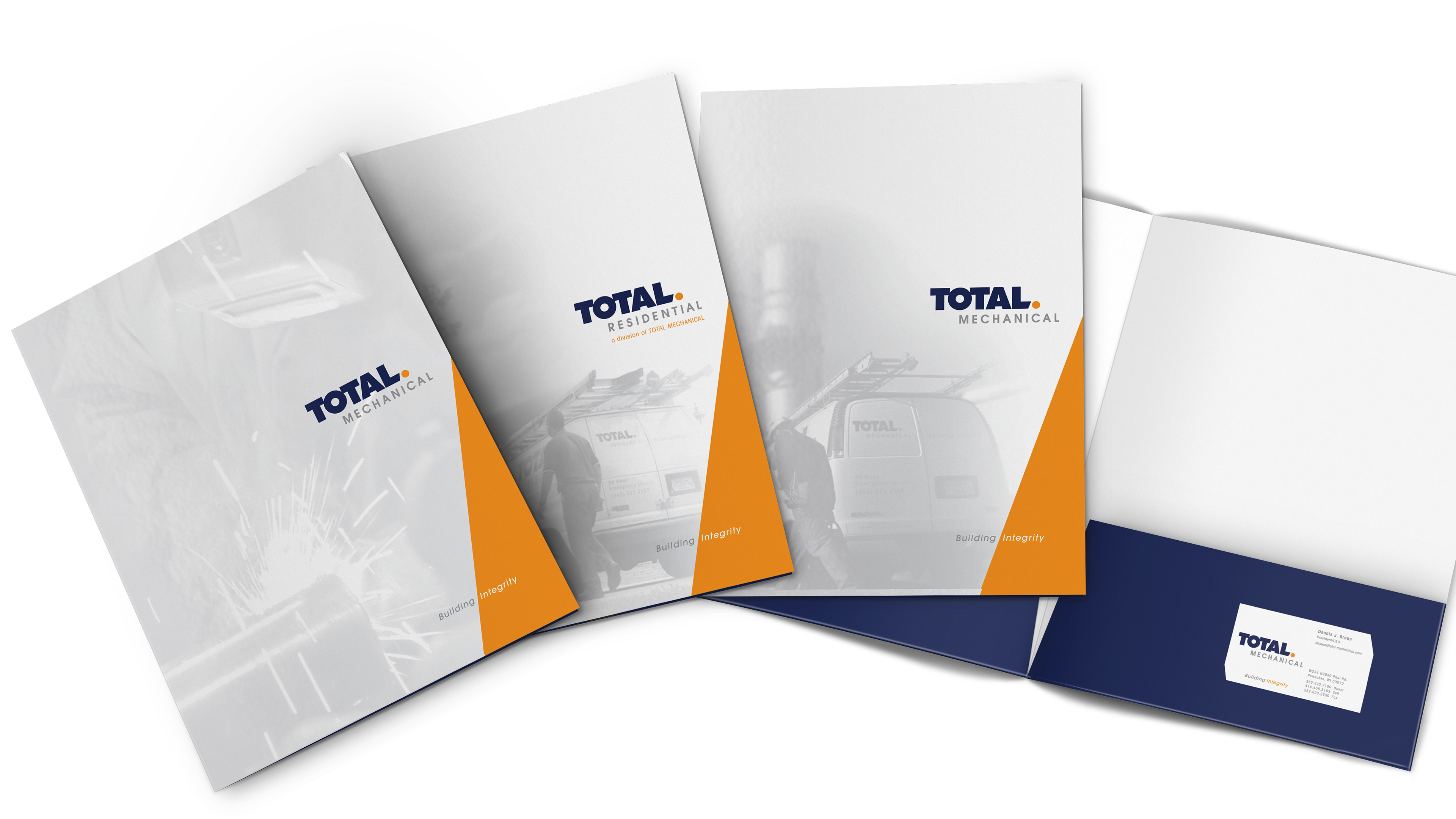
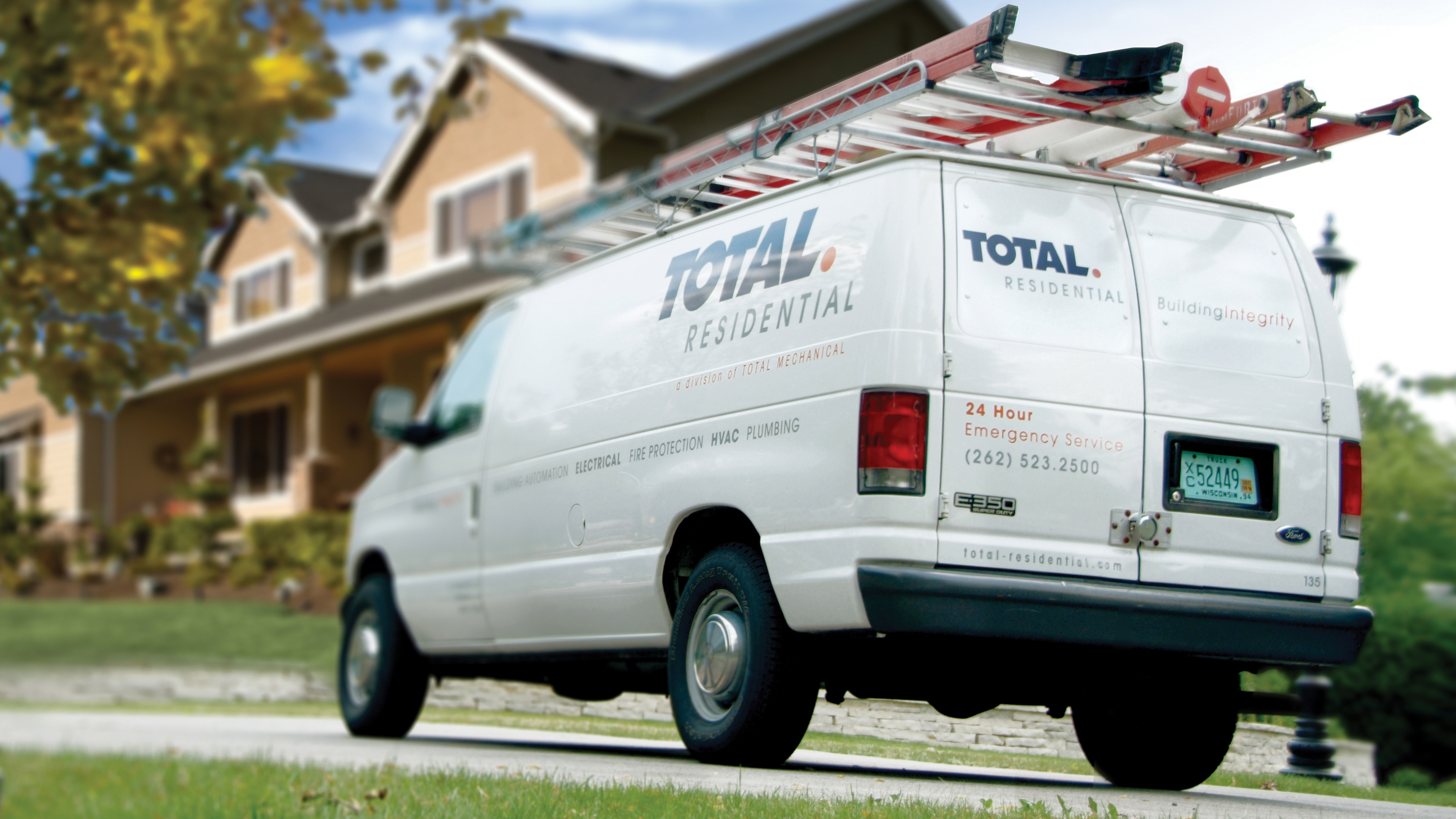
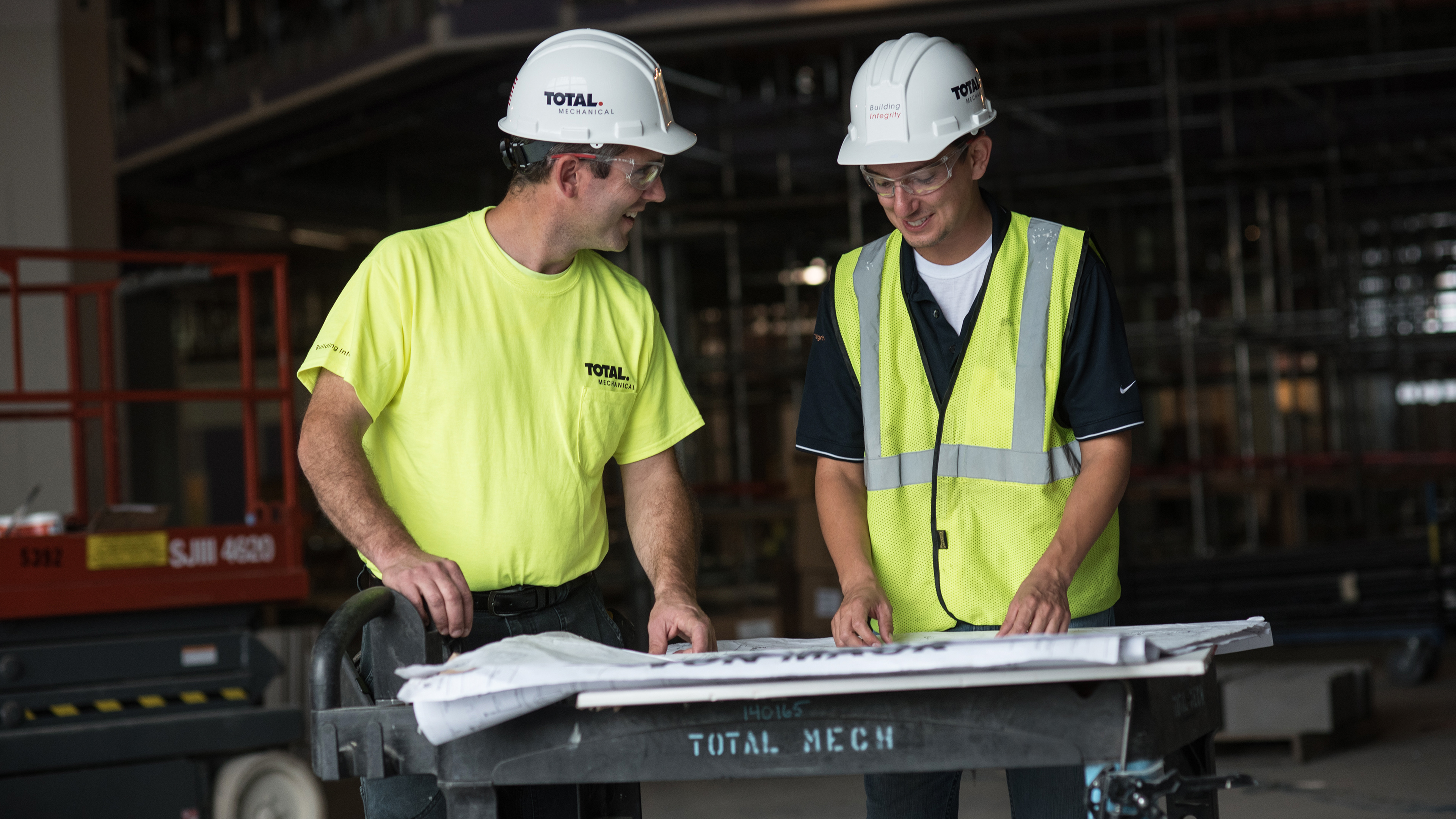
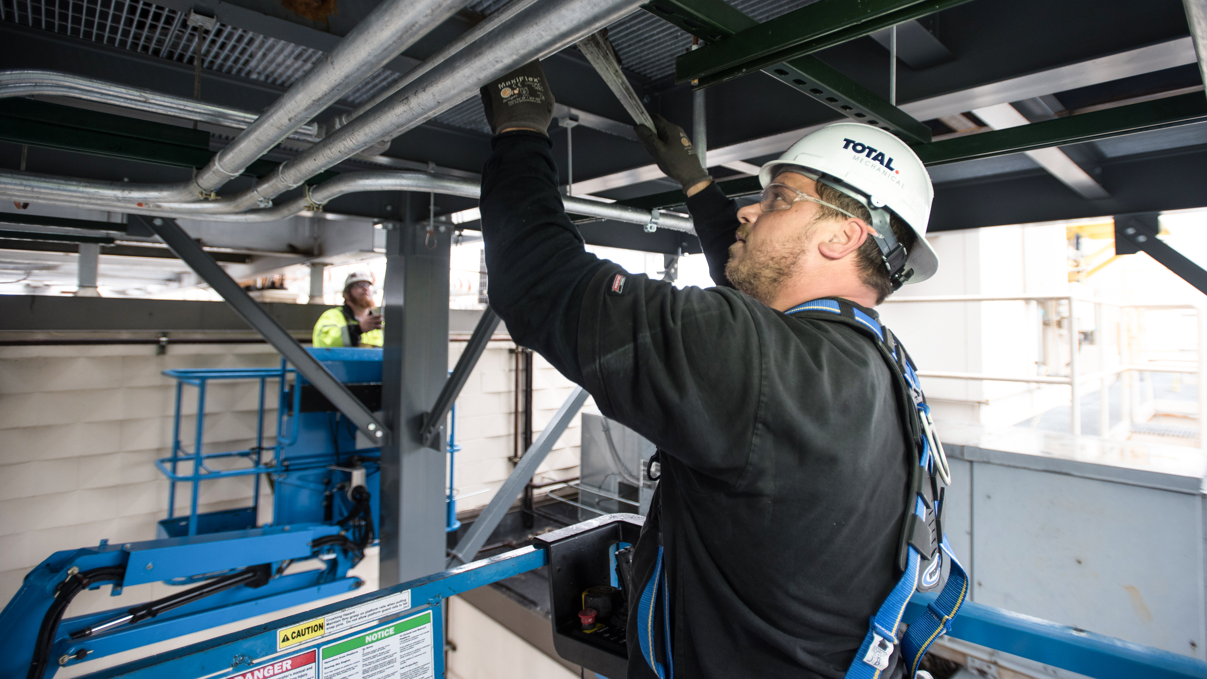
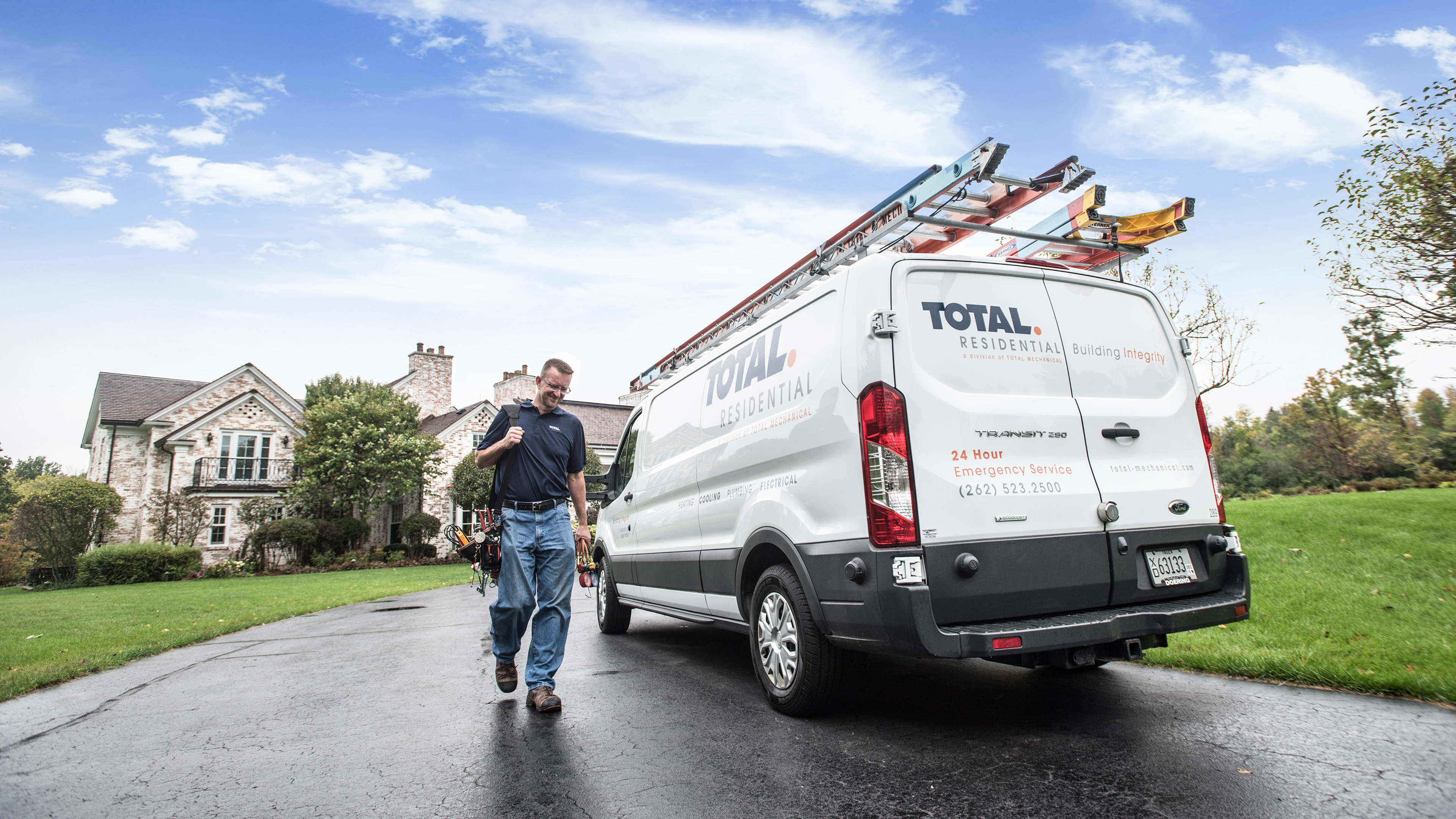
: Total Mechanical need a brand update to fully express it's position in the mechanical and residential contracting as well as it's expanding breadth of services. The update from the name Total Comfort to Total Mechanical and Total Residential creates a professional firm positioning with the ability to better tell its story.
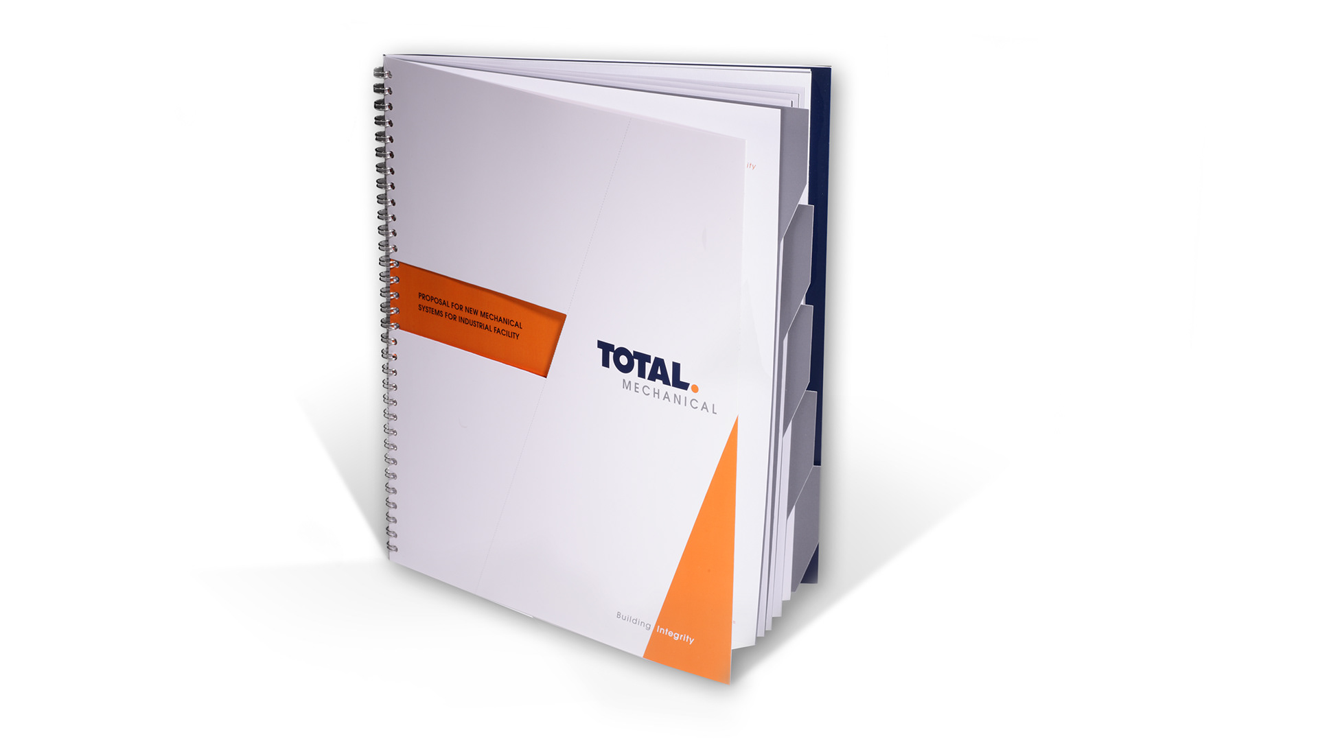
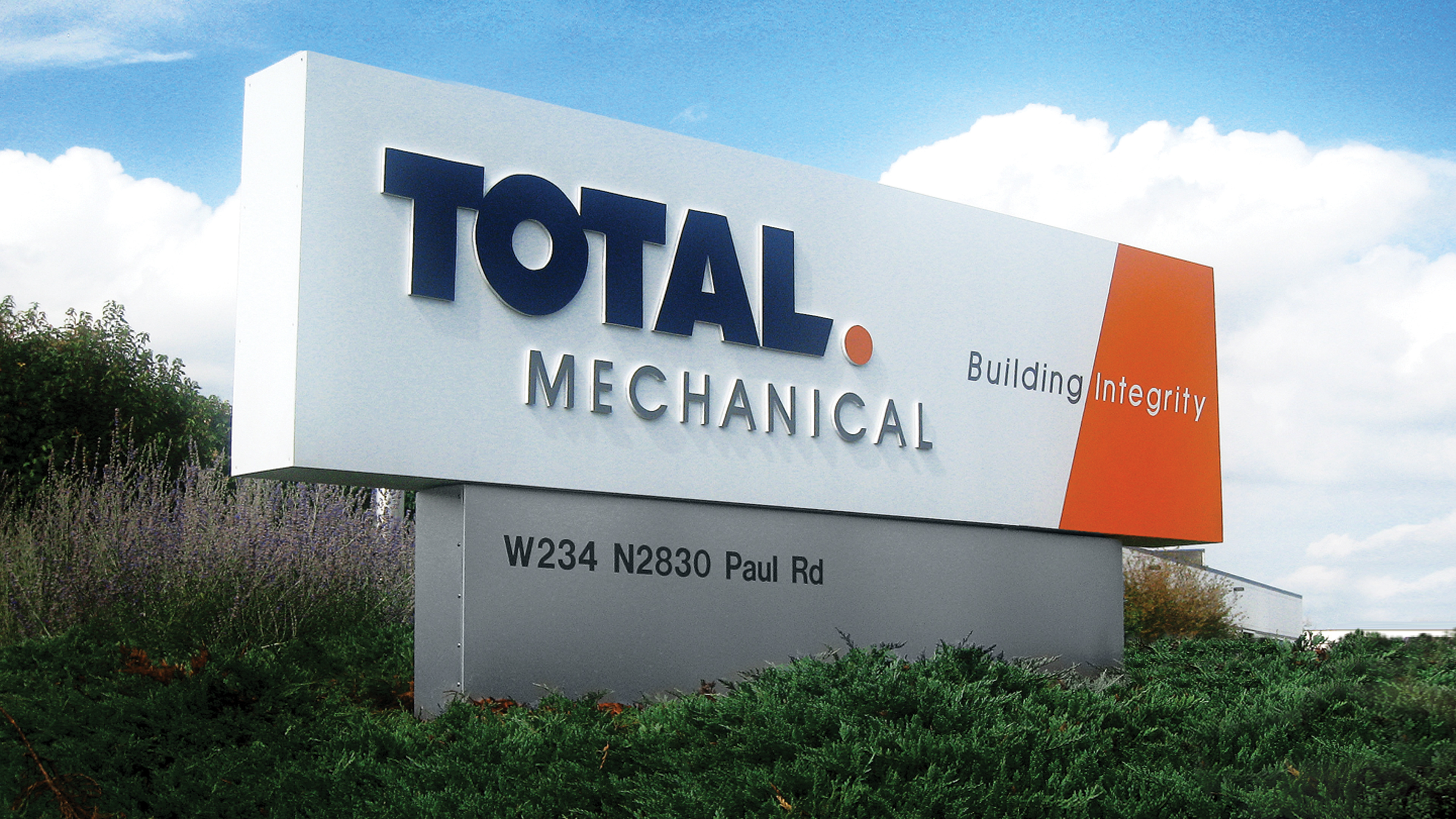
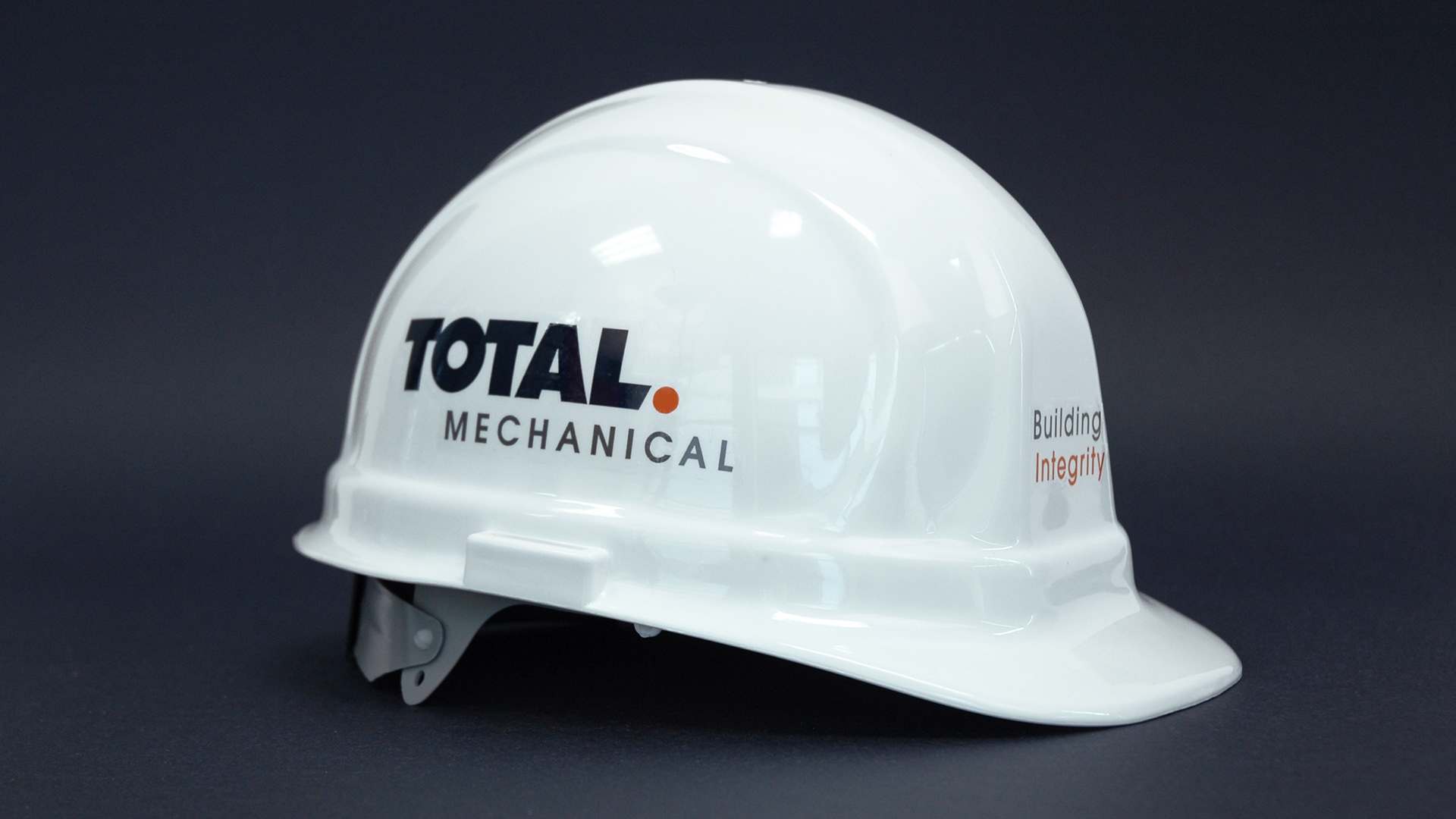
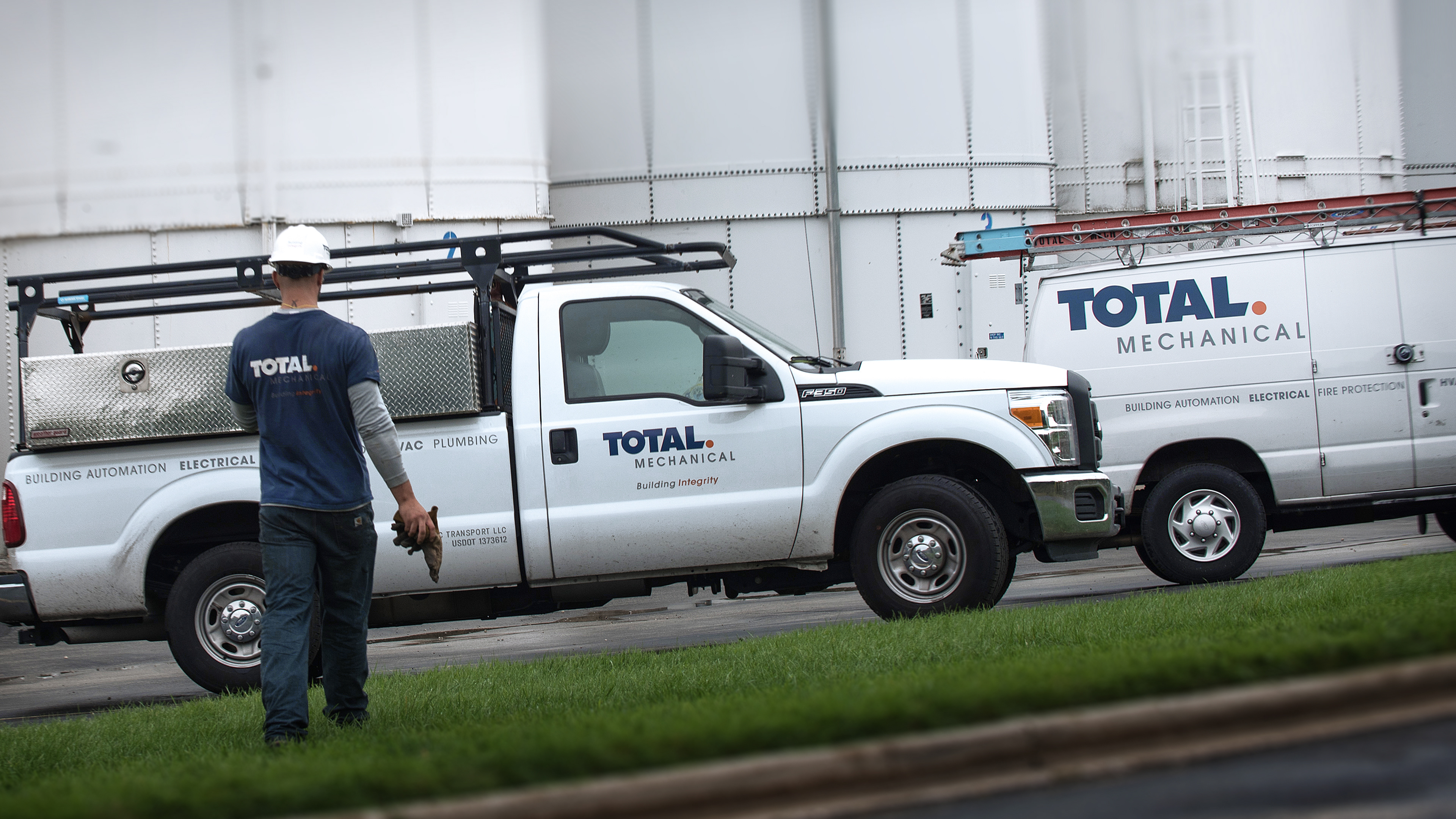
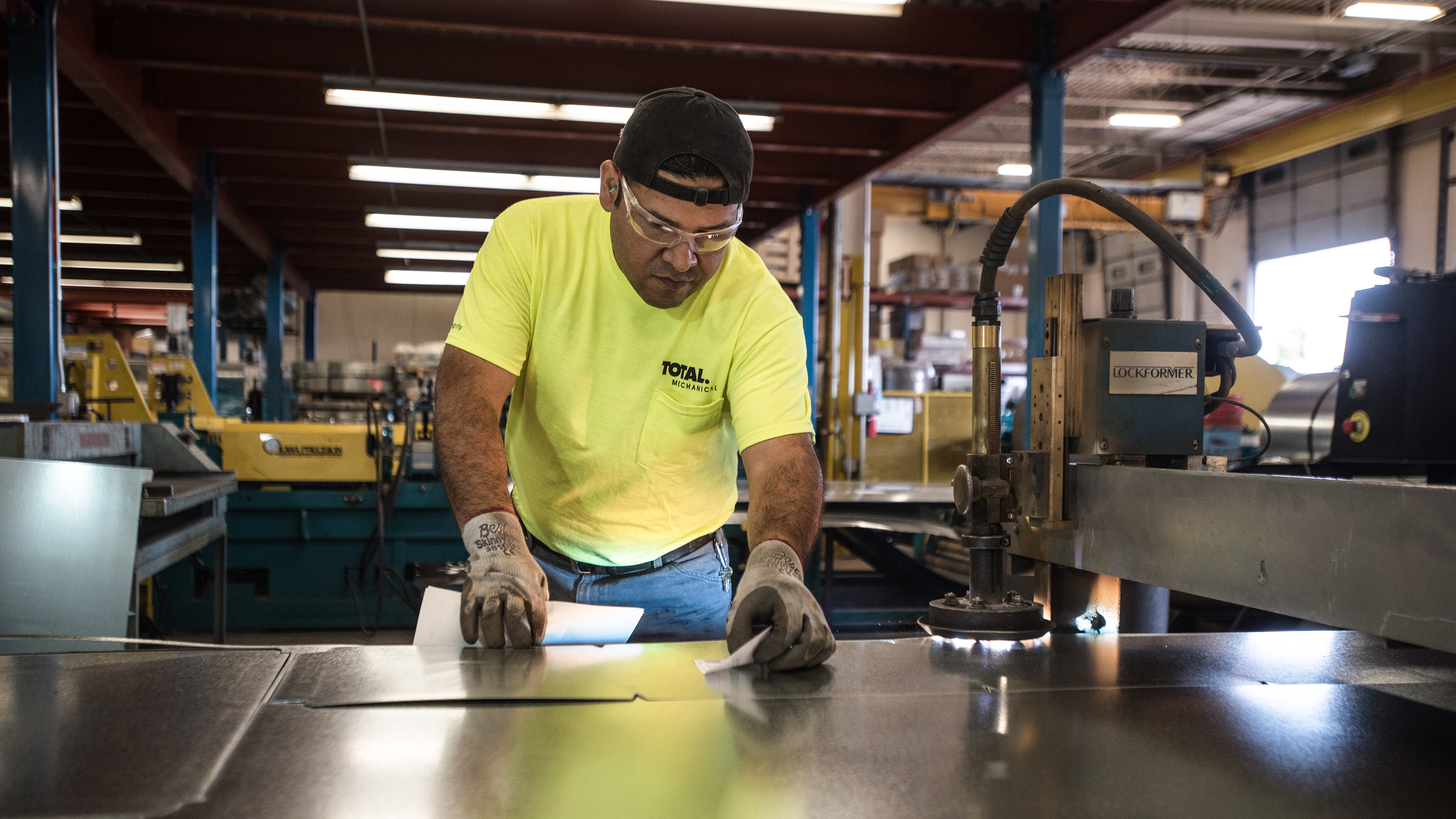
RESULTS: The new logo was created with an emphatic period after TOTAL to add emphasis to it’s total capabilities and project the strength and professionalism of the organization. The blue was a carry over from the previous branding, adding orange as an emphasis color and grey ground the palette in the company’s industrial roots. All communications pieces include the positioning phrase Building Integrity—a double meaning representing the company’s approach in all client relationships, as well as the building systems designed and installed by the firm.