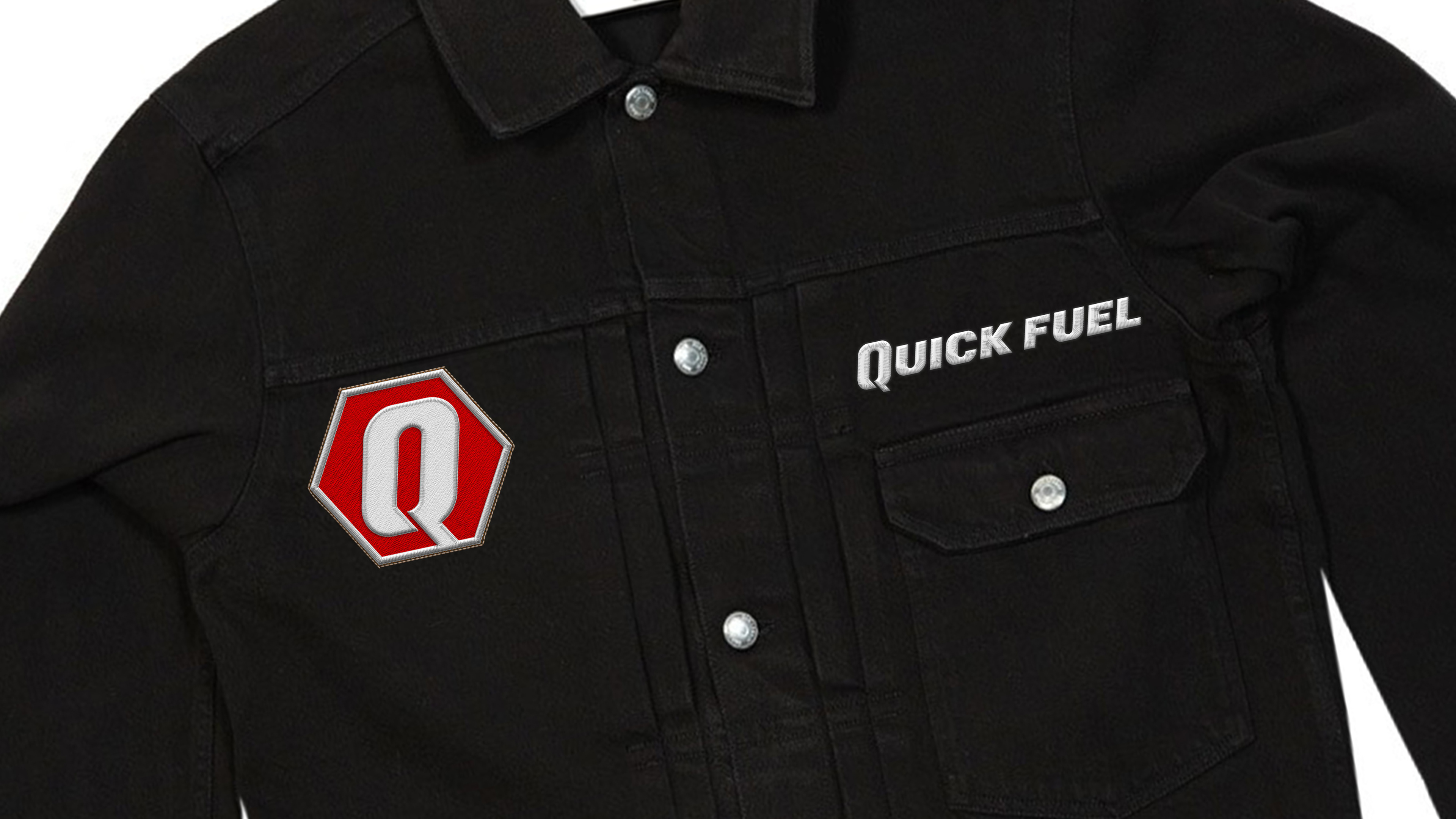
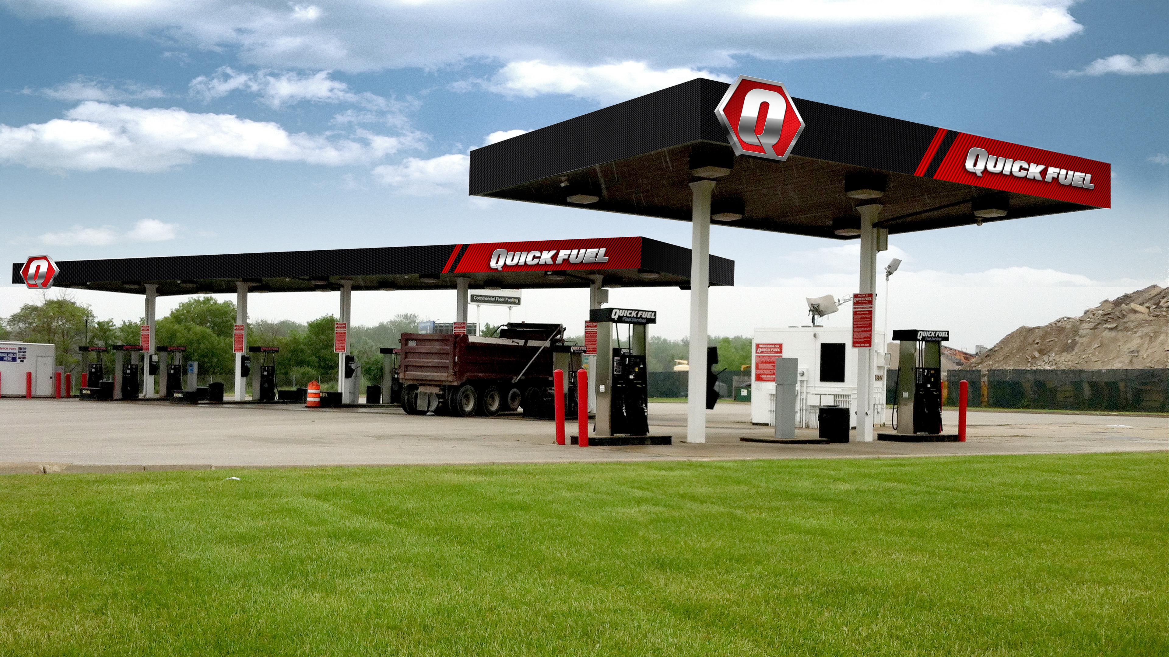
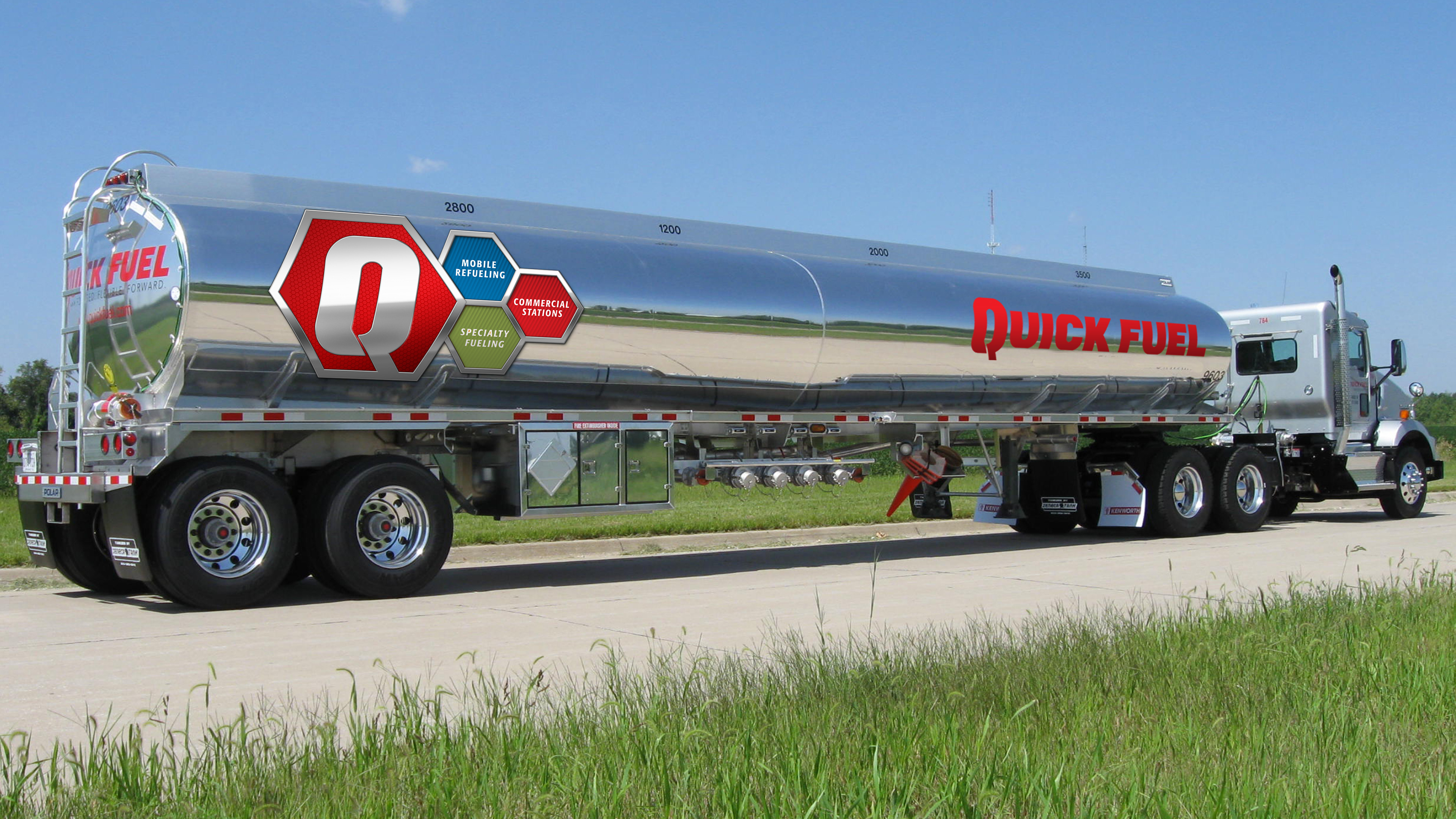
GOALS: The branding initiative for Quick Fuel was focused on developing a strong, cohesive visual identity that effectively communicated the company’s leadership in the commercial fueling sector. The aim was to ensure that every aspect of the brand—from signage and vehicle graphics to brochures and uniforms—was unified under a consistent and recognizable design language. This consistency was crucial for reinforcing Quick Fuel’s reputation for reliability, innovation, and quality service. Additionally, the branding needed to appeal to a broad audience, including corporate clients, partners, and end-users, while clearly differentiating the various services offered under the Quick Fuel brand.
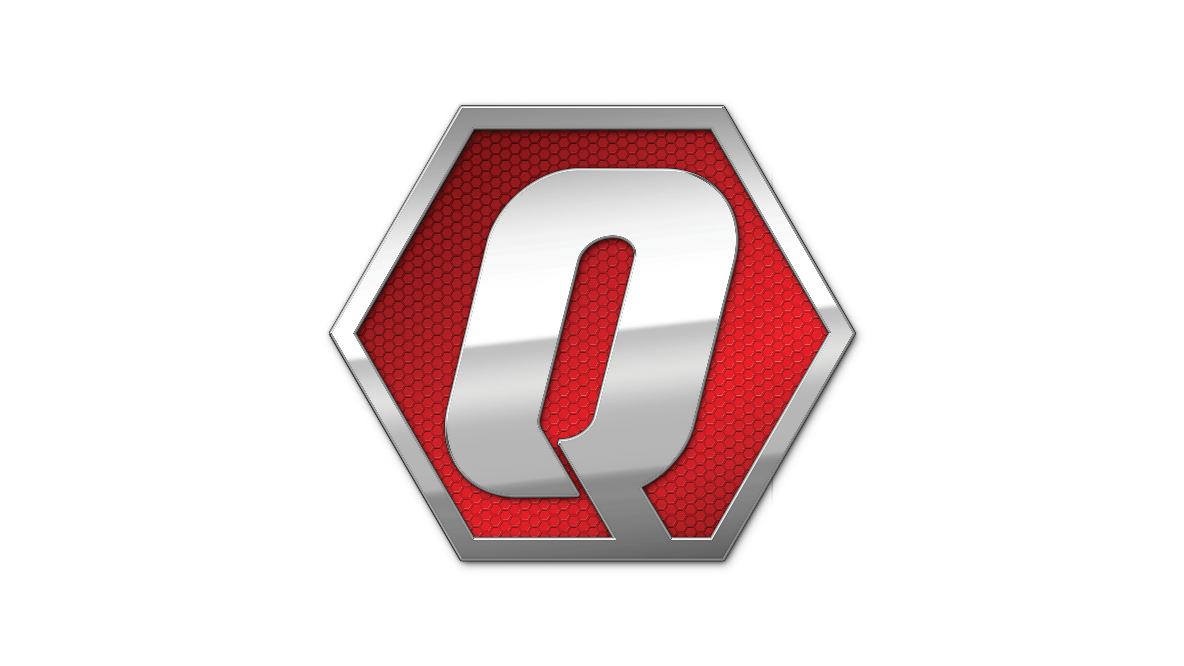
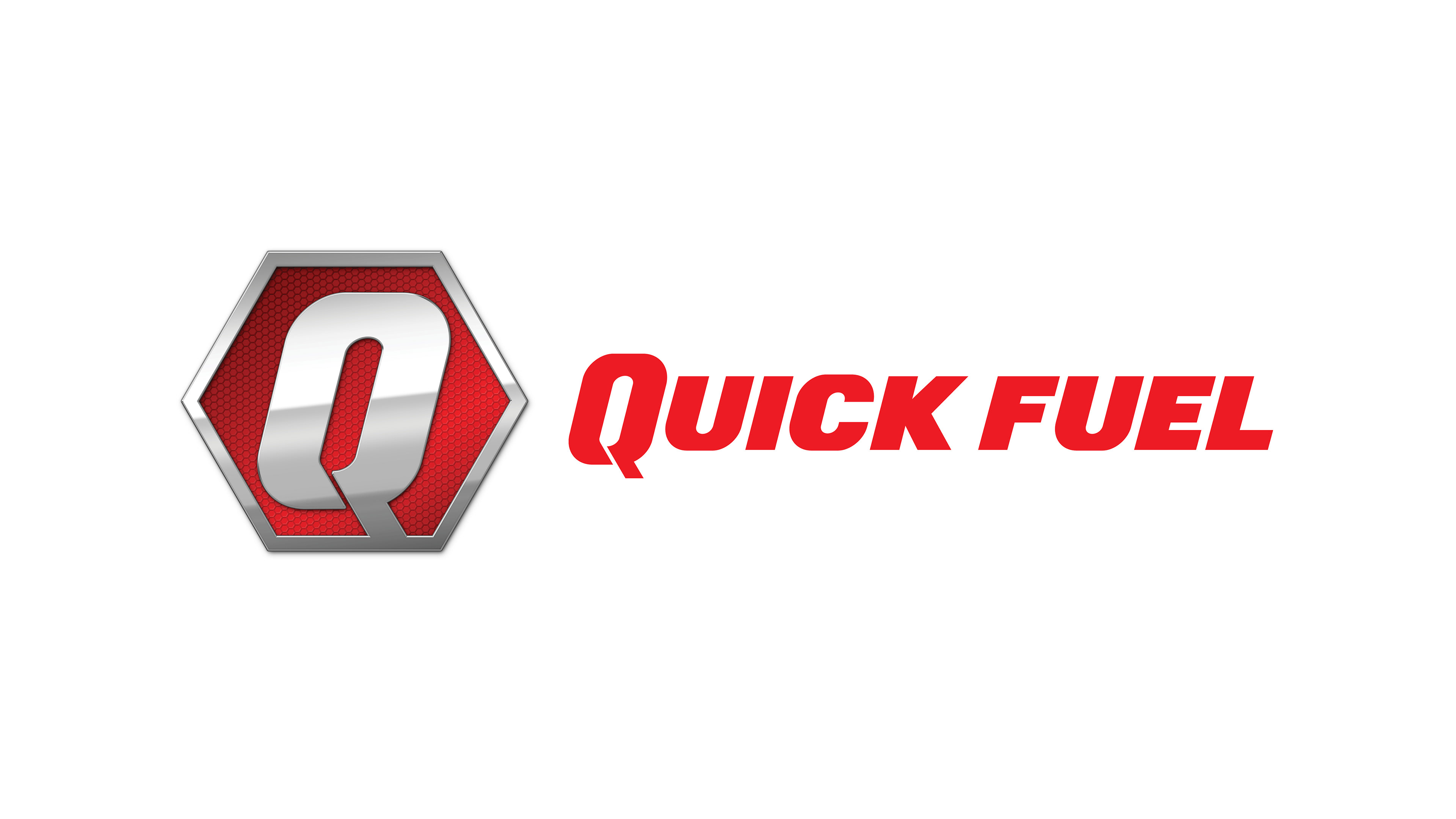
RESULTS: The result of the branding effort was a powerful and cohesive visual identity that resonated across all touchpoints. The consistent use of the QuickFuel Q-Hex icon, along with a carefully chosen color palette and typography, created a unified and professional brand presence. This identity was applied across a range of media, from monument signs and vehicle graphics to brochures and employee uniforms, ensuring that Quick Fuel was instantly recognizable and associated with quality and innovation in the commercial fueling industry. The cohesive branding not only enhanced the company’s visibility and market presence but also reinforced its position as a leader in the sector, supporting its ongoing growth and success.